This is a simple, eye-catching and effective design, because instantly the audience are introduced to the film. The trailer is one of the first things they see, since it's on the homepage.
Here, we added the film's title, (not the final font), the navigation hyperlinks, a mock-up embedded player, and our chosen photo.
This photo shows "John Collins" and "The Man" standing together, showing unity, a common goal. However, "The Man" appears in silhouette; he is mysterious. What are his motivations for helping John? What secrets does he hide?
This is a third and almost final website design. The original photo has had the contrast increased and saturation decreased for a more "gritty" effect, and to highlight the details of the picture. The edges have been vignetted a little to add to this effect. Finally, an orange filter was applied to give the setting a more epic, atmospheric feeling, by giving it the appearance of a sunset.
Underneath the navigation bar is the film's credits, just like the bottom of 310 to Yuma's website.
Underneath this is the film's MPAA rating. We chose an American rating as the film is distributed by Warner Bros. Although the film would probably be distributed worldwide, its main website would be aimed at a US audience.
The film credits are in the font "Unknown Caller BTN SC", which we feel best captures the look of the credits font seen on promotional film websites such as 310 to Yuma.
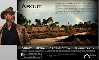
 We also added a second page, "About", to demonstrate how the website's navigation system works. We originally planned to make use of roll-overs for this, but failing to get them to work, switched to simple hyperlinks. Clicking on the title of the page takes you to the next, although is difficult to show on here.
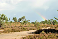
The background is a landscape shot taken during filming, chosen for its barrenness. The rainbow suggests the possibility of a resolution, perhaps John Collins will be able to find justice once and for all?
 We then cut out an image of one of the film's main characters, "The Man", and placed him on top. This was inspired by 310 to Yuma's "About" page, seen on this site. Both images were enhanced with contrast and saturation, to match the look of the first page.
 The page also includes a brief description of the film.


No comments:
Post a Comment